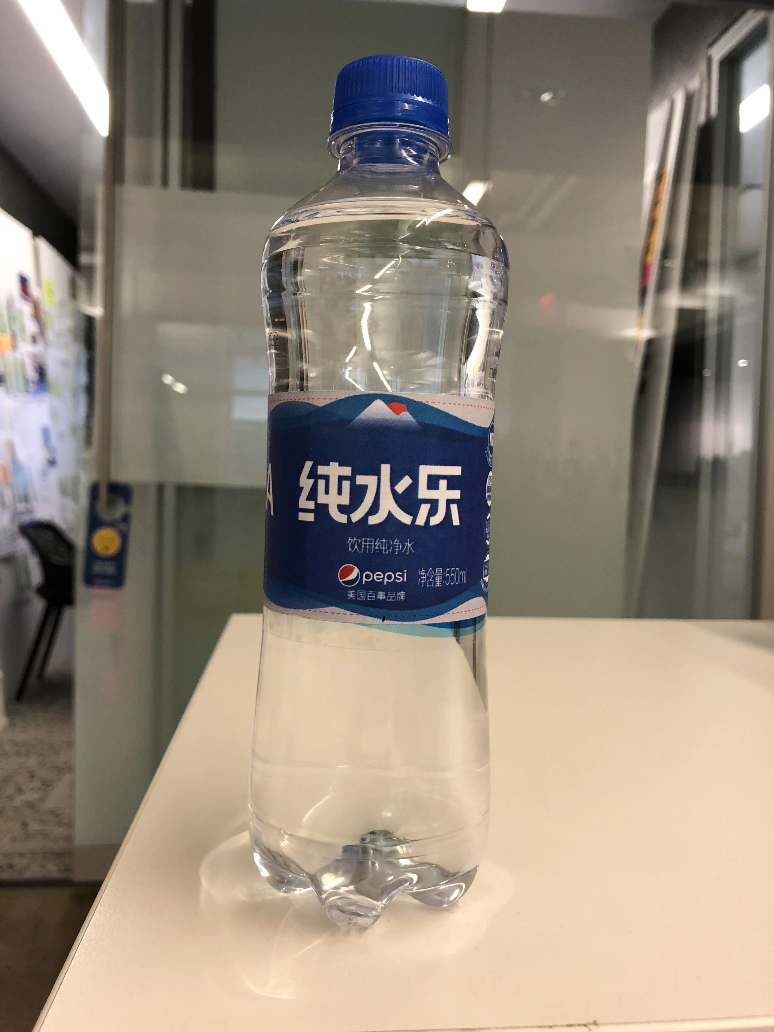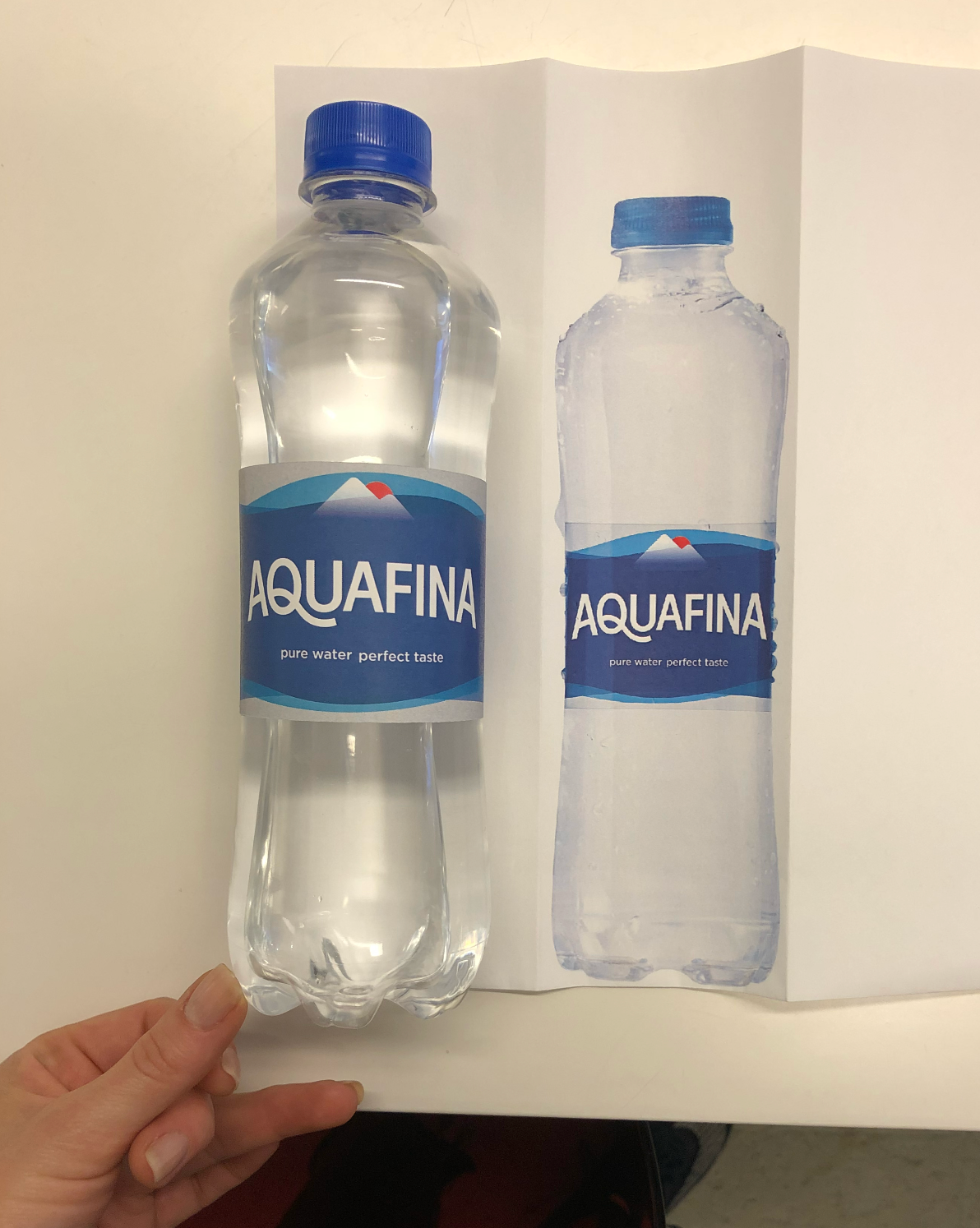
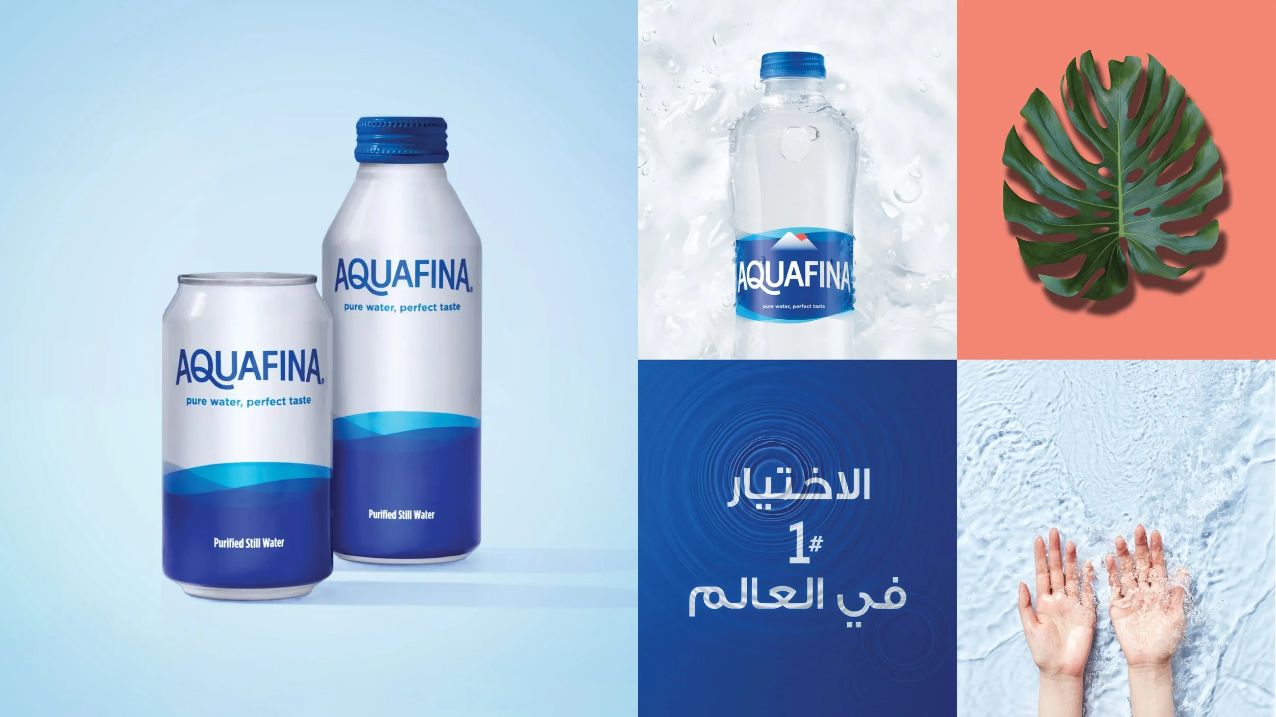
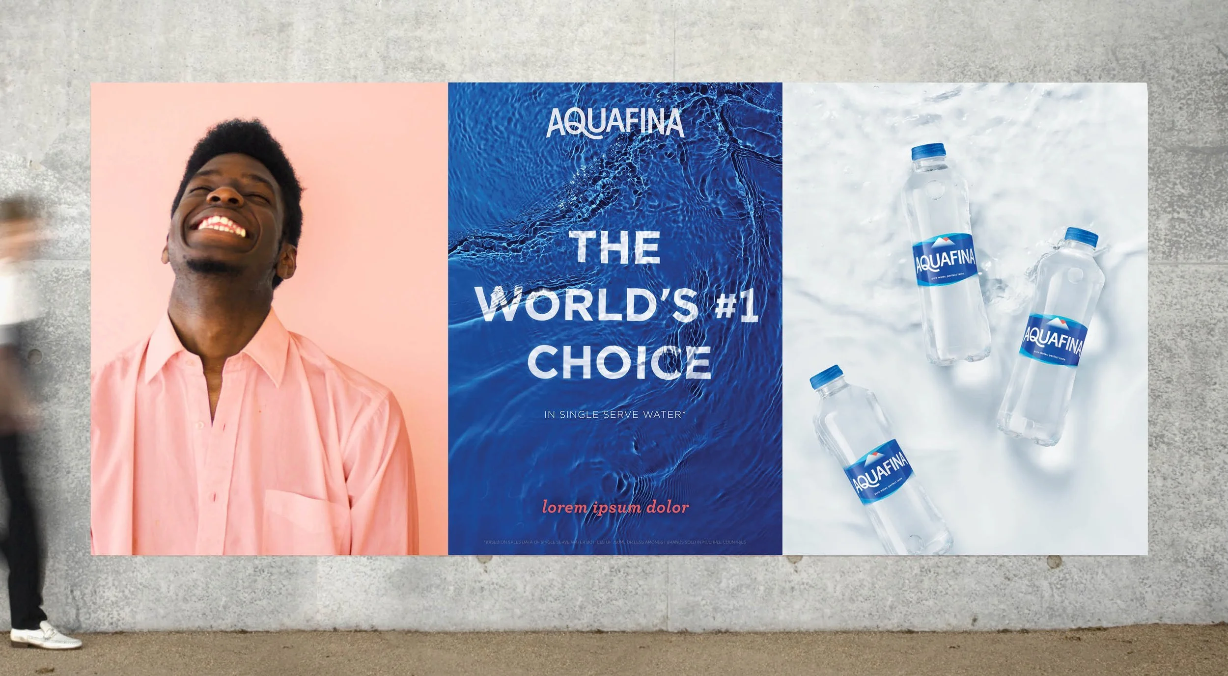
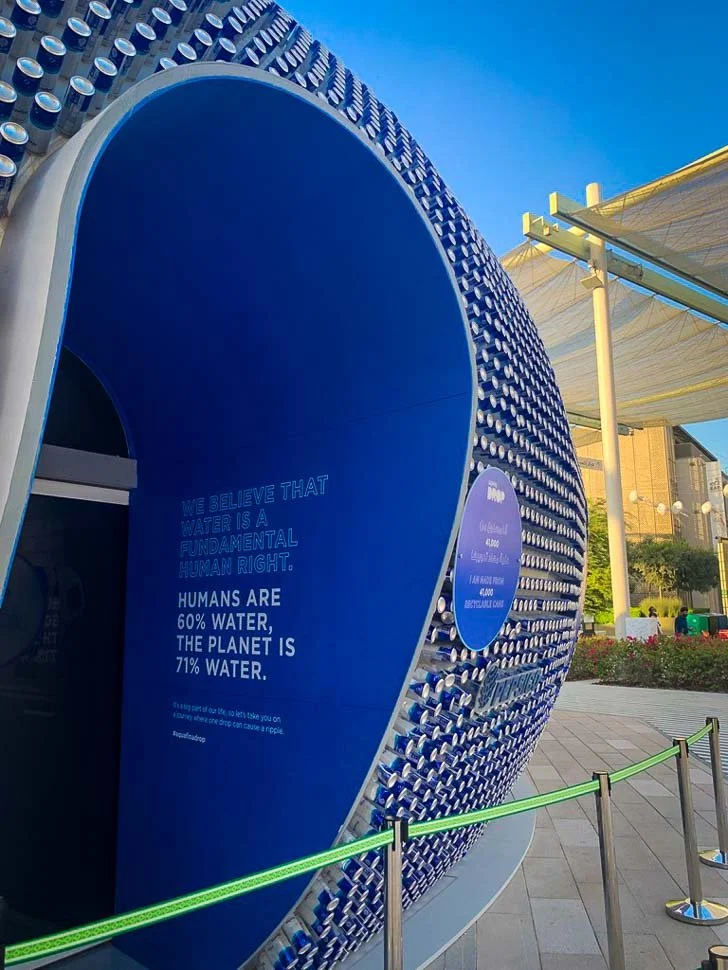
Aquafina Global Redesign
Same pure water and perfect taste, with a new look. The new Aquafina visual identity captures a sense of simplicity and modernity.
we wanted our 2021 approach to be fresh and forward-looking, while building on the purity, clarity, and simplicity of earlier designs—the same less-is-more spirit inherent to the water itself.
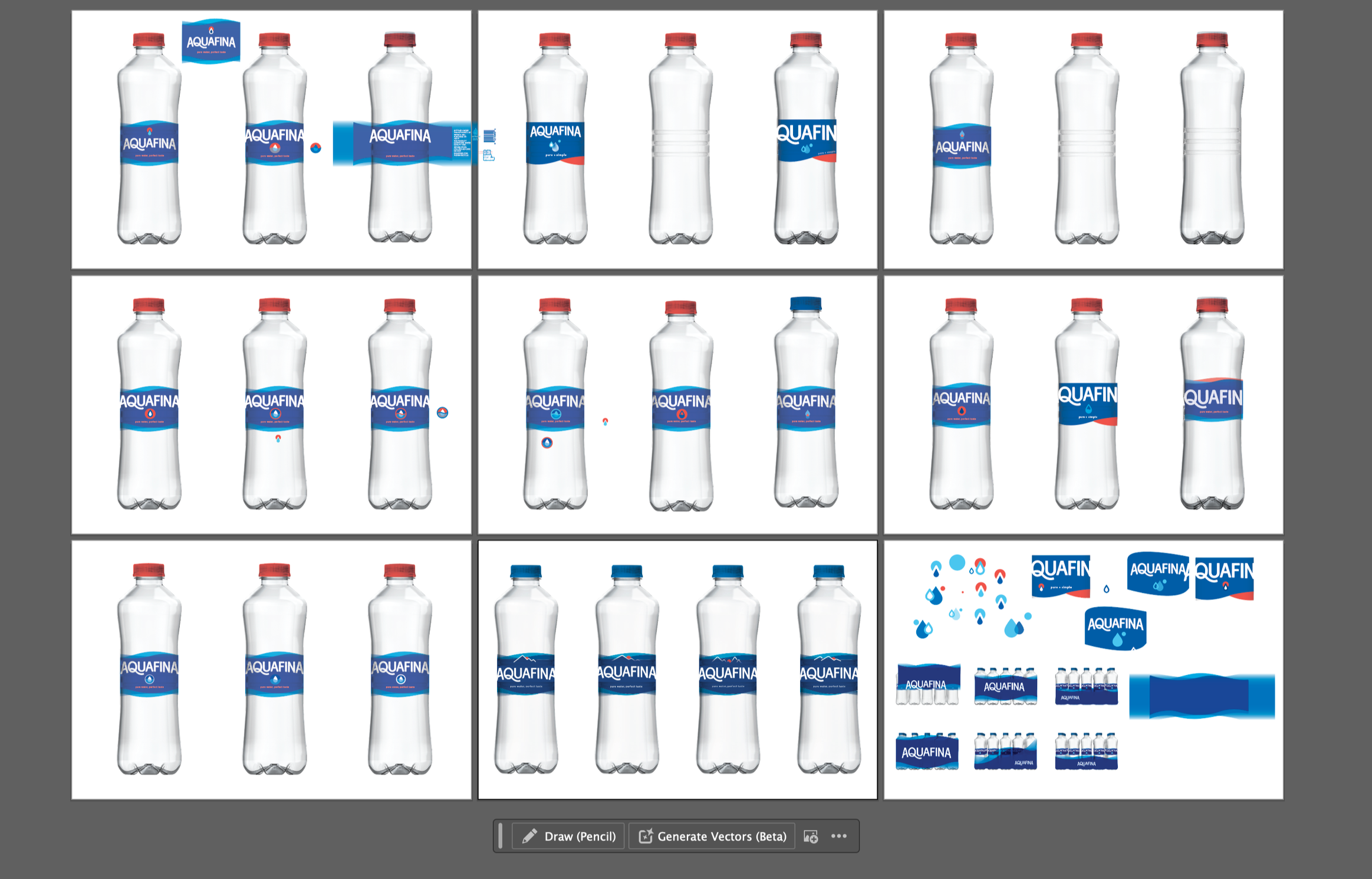
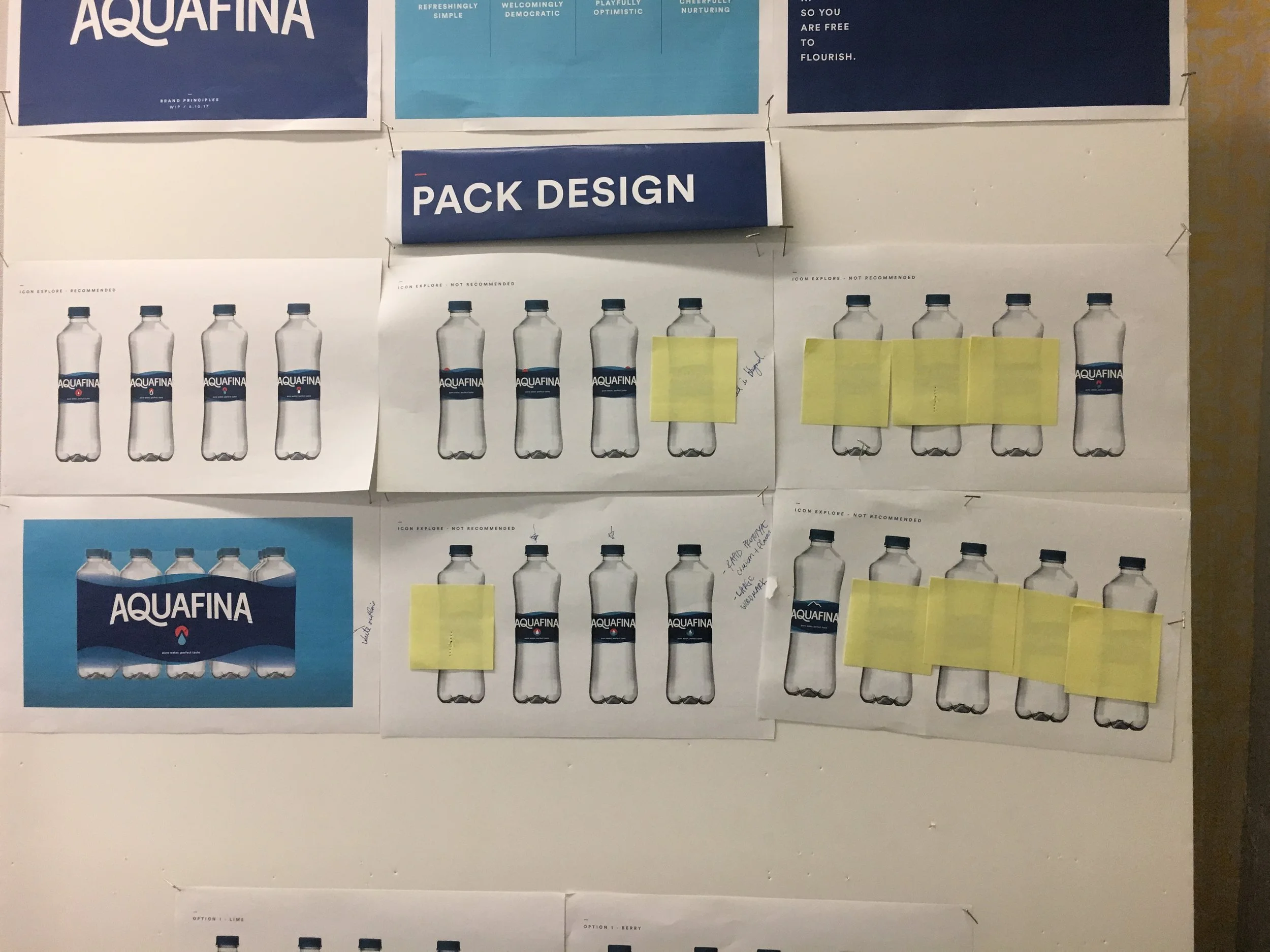
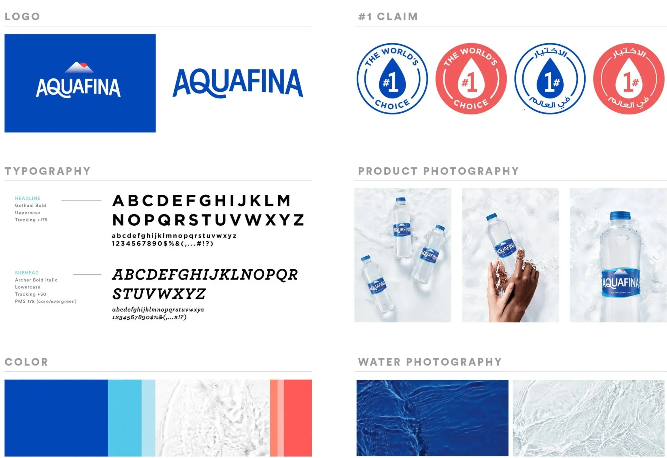
We believe that filtering out what’s unnecessary leaves you with more, not less—so we nodded to the old design while removing the excess. The logotype remained sans serif but was updated to more modern, heavier weight lettering that reflects consumer confidence in this trusted water. The swoop of the Q carries forward from earlier iterations of the logo, a visual nod to the flow of water.
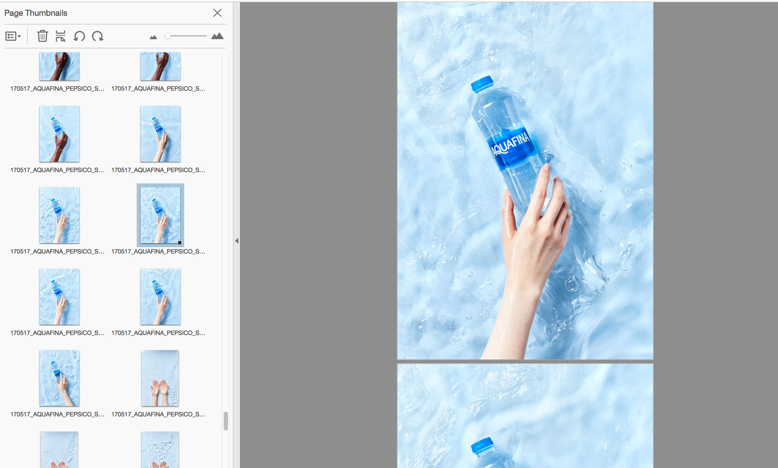
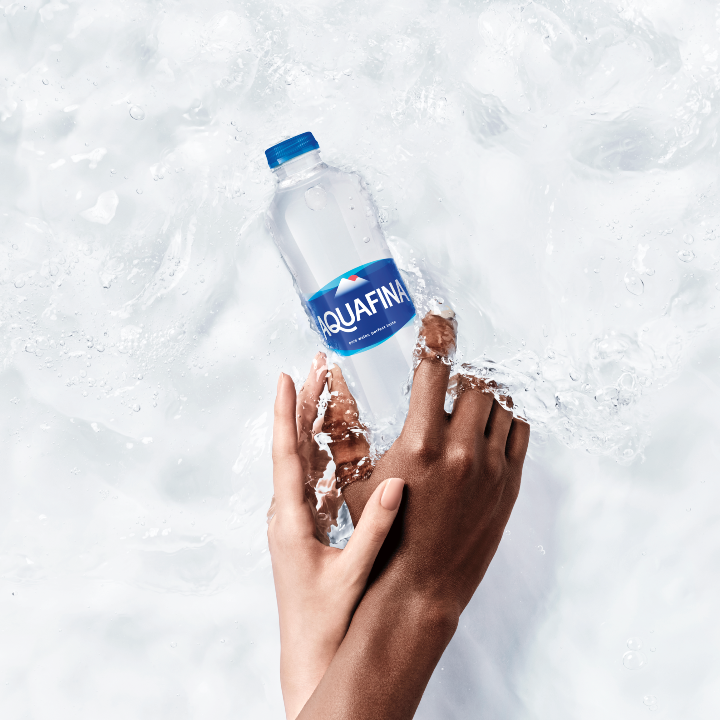
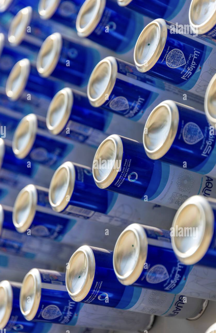
Dynamic, simple and real, the new Aquafina visual identity is grounded in ownable water cues depicted through refreshing, flowing water in movement. The solid background of the old design became translucent overlapping waves in three shades, starting with the same recognizable Aquafina

Same pure water and perfect taste, with a new look. The new Aquafina visual identity captures a sense of simplicity and modernity.
we wanted our 2021 approach to be fresh and forward-looking, while building on the purity, clarity, and simplicity of earlier designs—the same less-is-more spirit inherent to the water itself.
We believe that filtering out what’s unnecessary leaves you with more, not less—so we nodded to the old design while removing the excess. The logotype remained sans serif but was updated to more modern, heavier weight lettering that reflects consumer confidence in this trusted water. The swoop of the Q carries forward from earlier iterations of the logo, a visual nod to the flow of water.
Dynamic, simple and real, the new Aquafina visual identity is grounded in ownable water cues depicted through refreshing, flowing water in movement. The solid background of the old design became translucent overlapping waves in three shades, starting with the same recognizable Aquafina


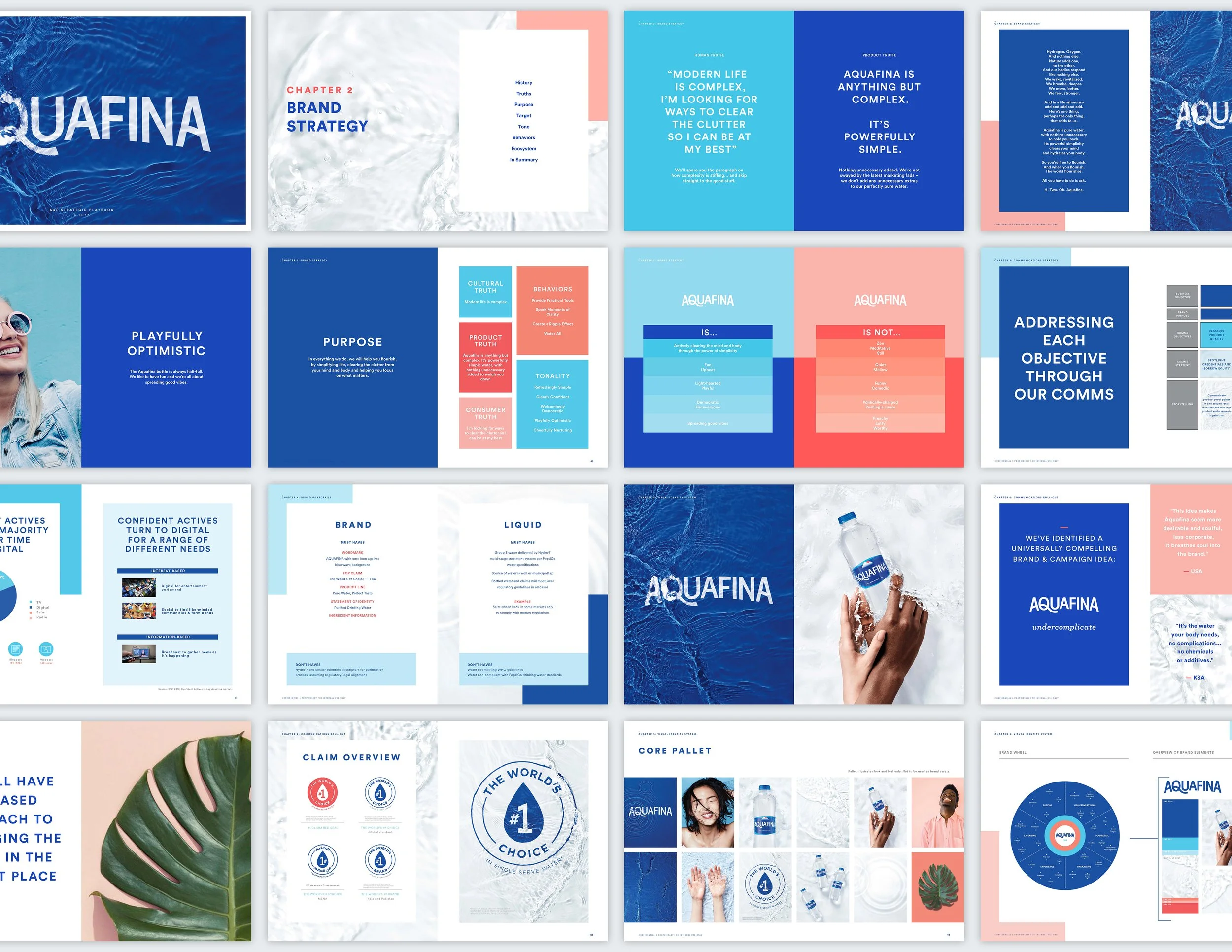
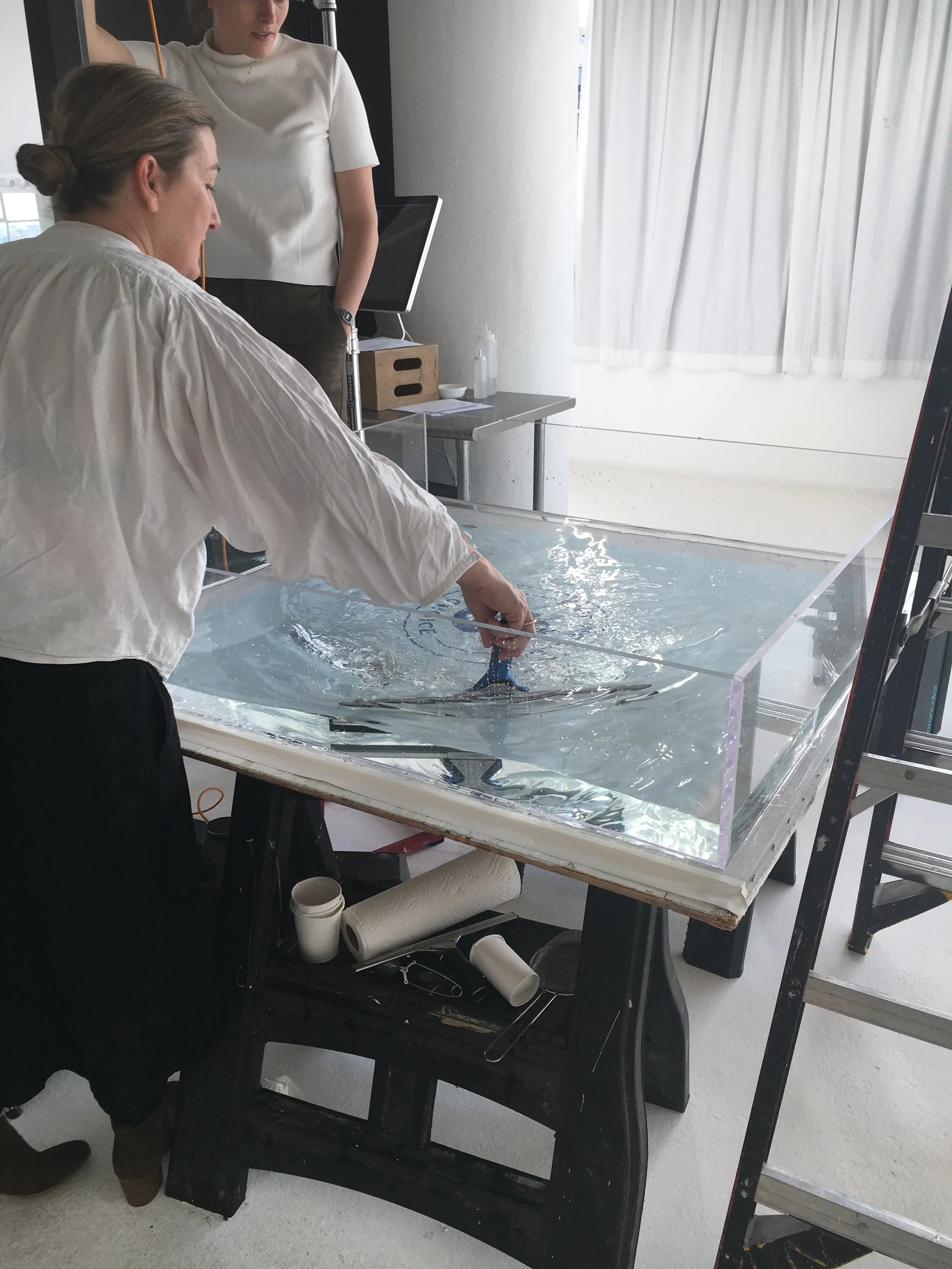
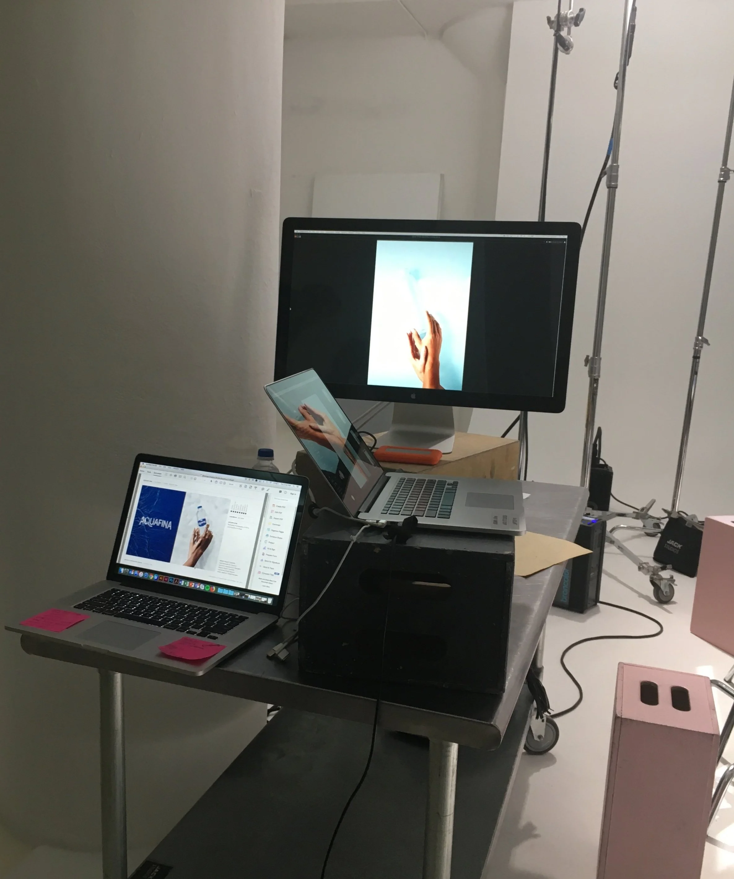
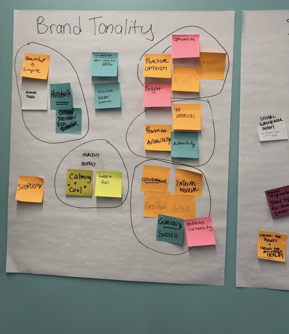
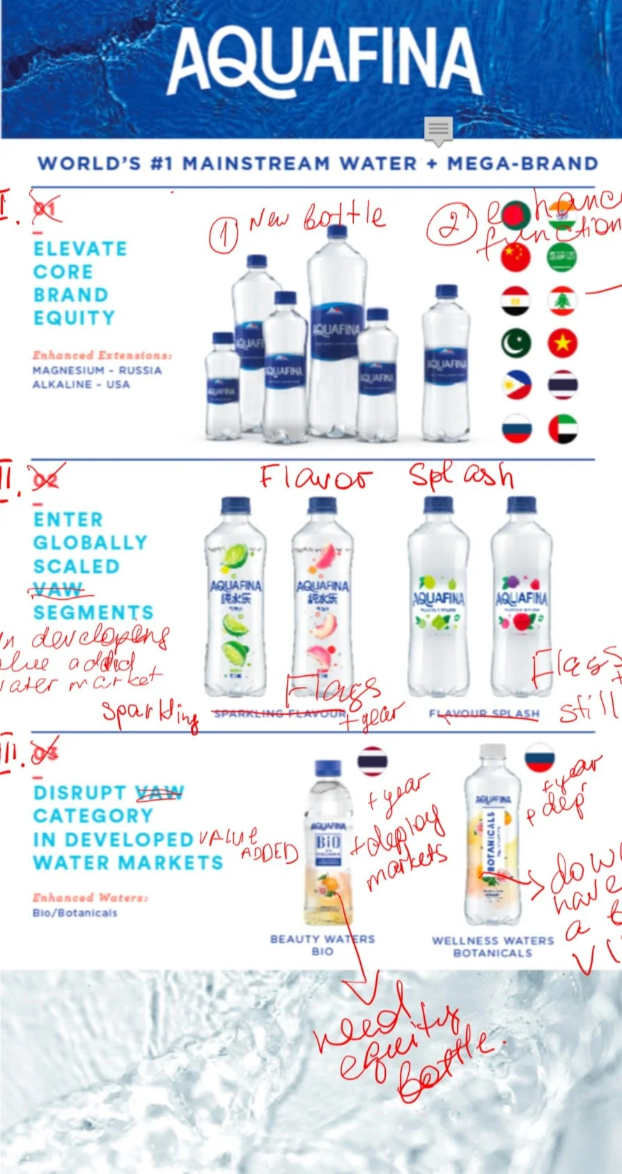
Process Work